Work

Autodesk: Brand Identity

Portland

Brand identity refresh for a leading software company restless to build a better world.

Autodesk: Brand Identity
Current Time 0:00
/
Duration Time 0:00
Progress: NaN%
Current Time 0:00
/
Duration Time 0:00
Progress: NaN%
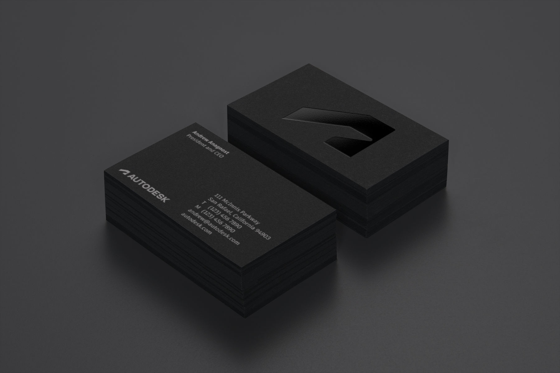
ADSK_BusinessCard_Angled
Current Time 0:00
/
Duration Time 0:00
Progress: NaN%

The many challenges facing the world right now call for radical new ways of making—with fewer resources, with less waste, with fewer boundaries between roles and industries, with more people and perspectives. Autodesk is already uniquely qualified for this moment, having built the infrastructure to help people who create do just that. Armed with this key insight, the W+K team recognized that the new brand needed to bridge humanism and futurism, balancing empathetic real-world problem solving with the optimism of handling next-generation challenges.

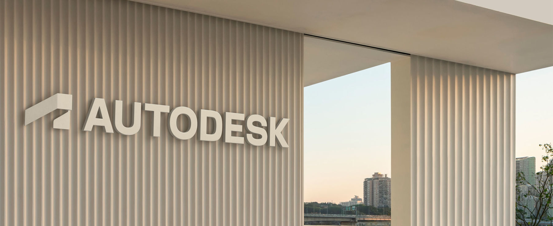
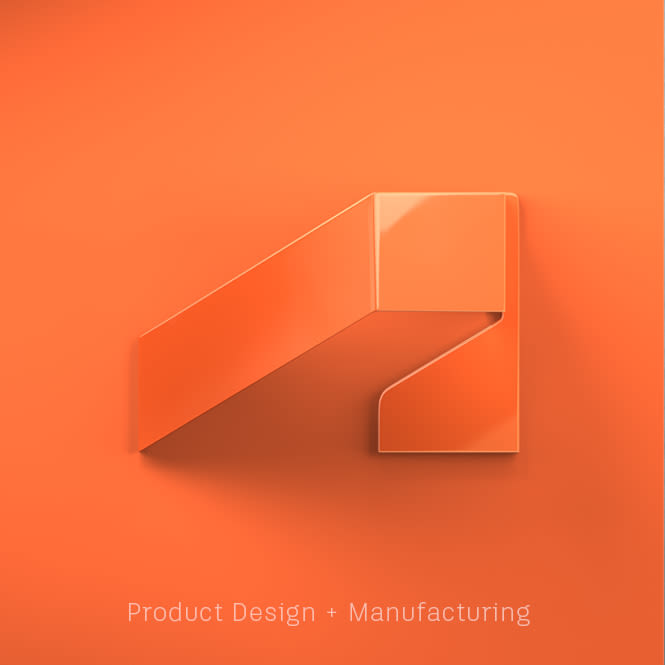
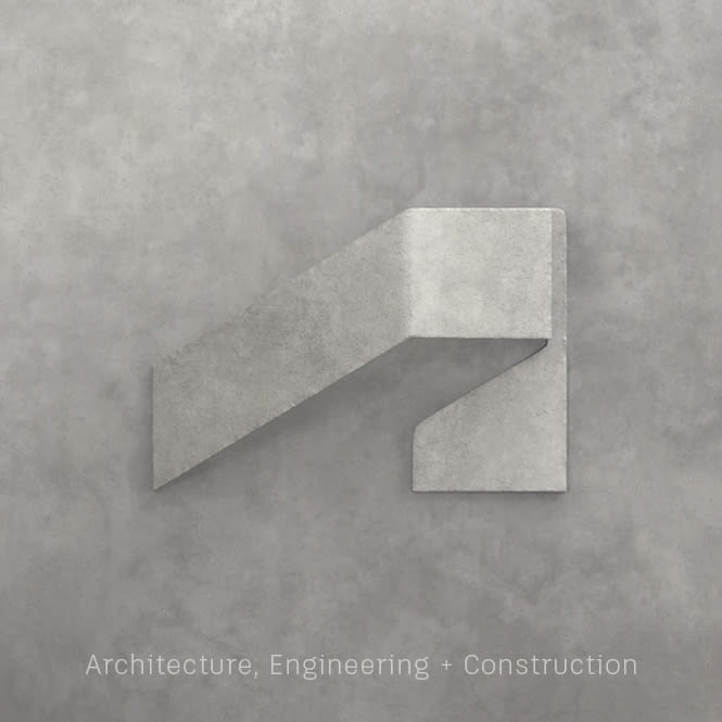
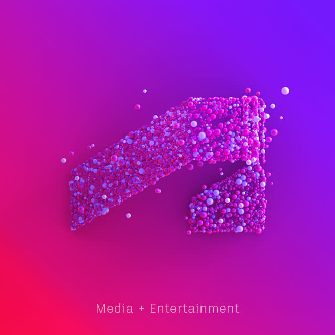
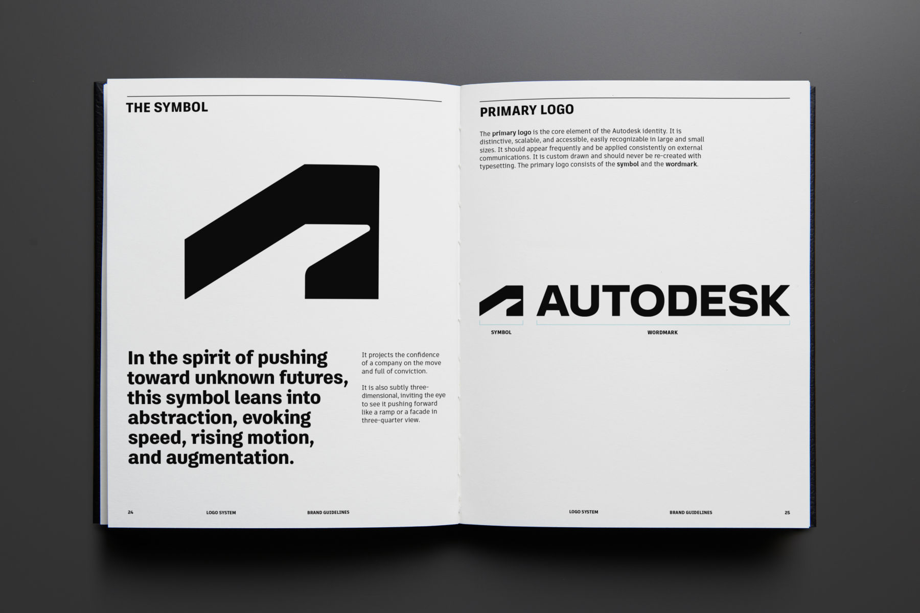
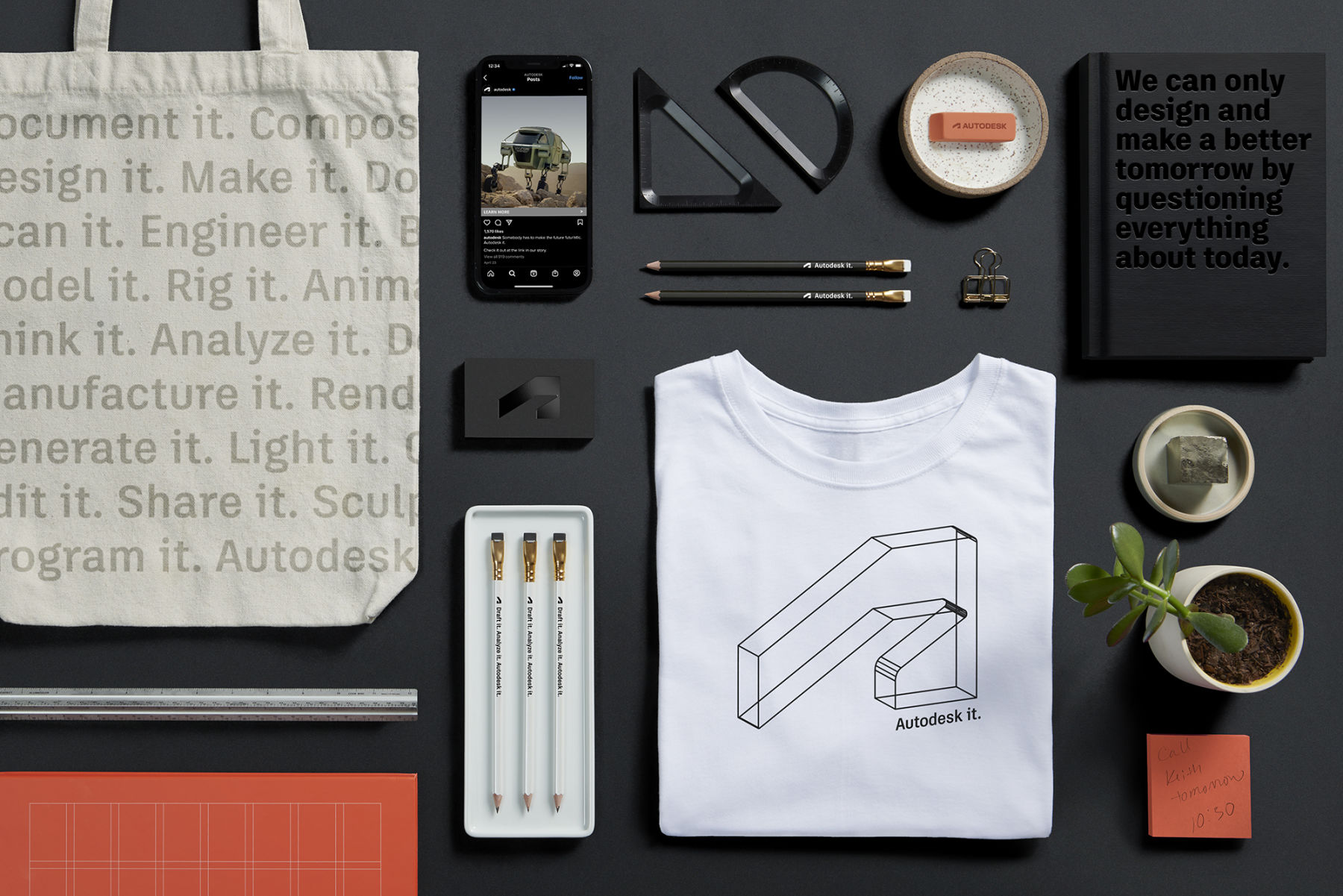
The visual identity is emblematic of these principles. The three-dimensional symbol that anticipates the letter “A” is a nod to Autodesk’s legacy. But in this case, it is one that can be seen from different angles, maintaining a look of development and abstraction, reflecting the range of concepting and process that the act of creating requires. In its flattened, graphic state, the symbol attempts to draw the eye away to the lower left, but then pulls it back to the point where the intended dimensions converge, creating a dynamic vibrancy that launches the identity into the future. This symbol is further developed as brand imagery, taking on various materials and lighting to represent all the possibilities of the Autodesk software.

Current Time 0:00
/
Duration Time 0:00
Progress: NaN%
Current Time 0:00
/
Duration Time 0:00
Progress: NaN%
Current Time 0:00
/
Duration Time 0:00
Progress: NaN%
Current Time 0:00
/
Duration Time 0:00
Progress: NaN%
Current Time 0:00
/
Duration Time 0:00
Progress: NaN%
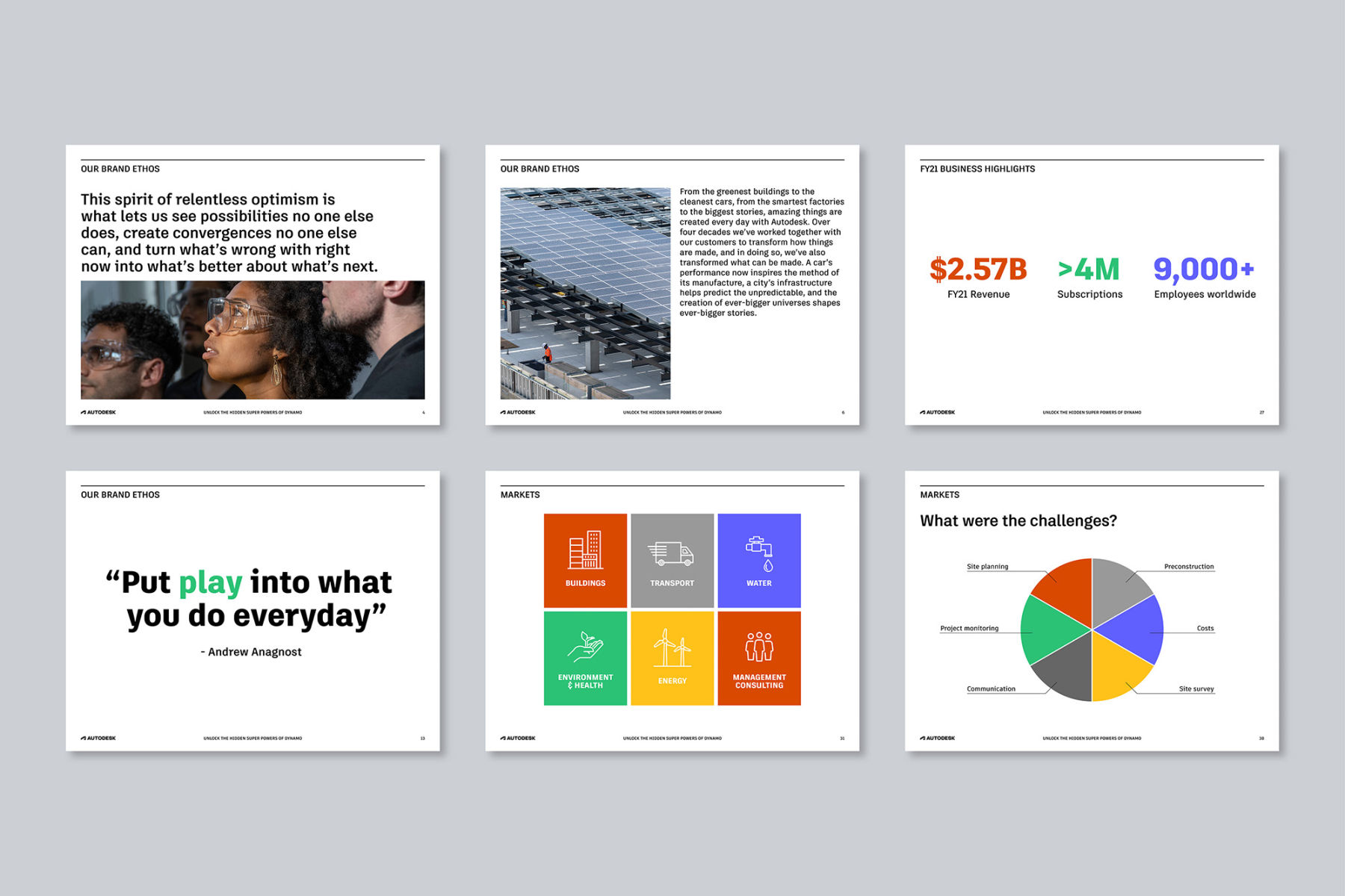
Autodesk ppt
Current Time 0:00
/
Duration Time 0:00
Progress: NaN%

Product Identity System

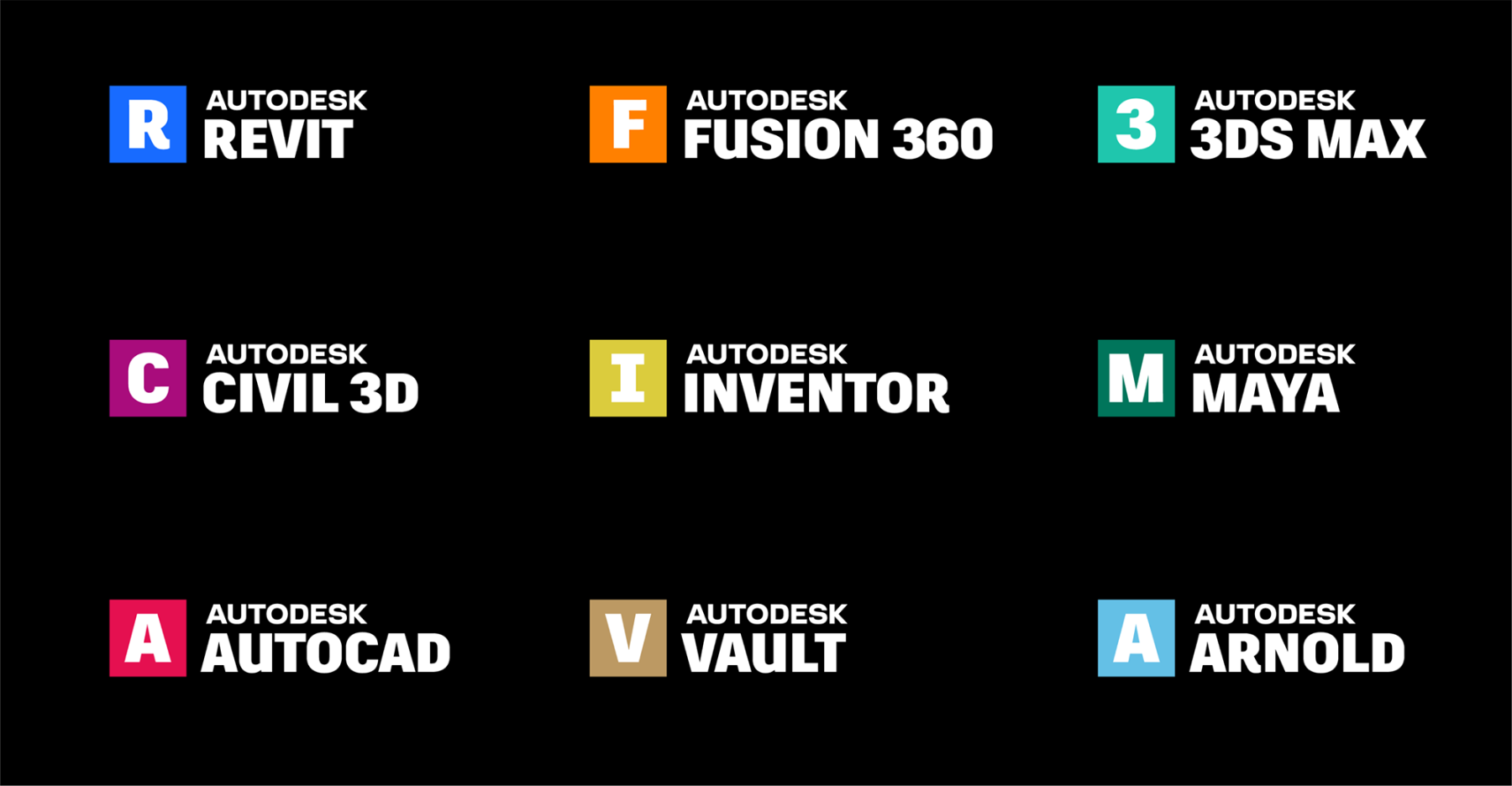
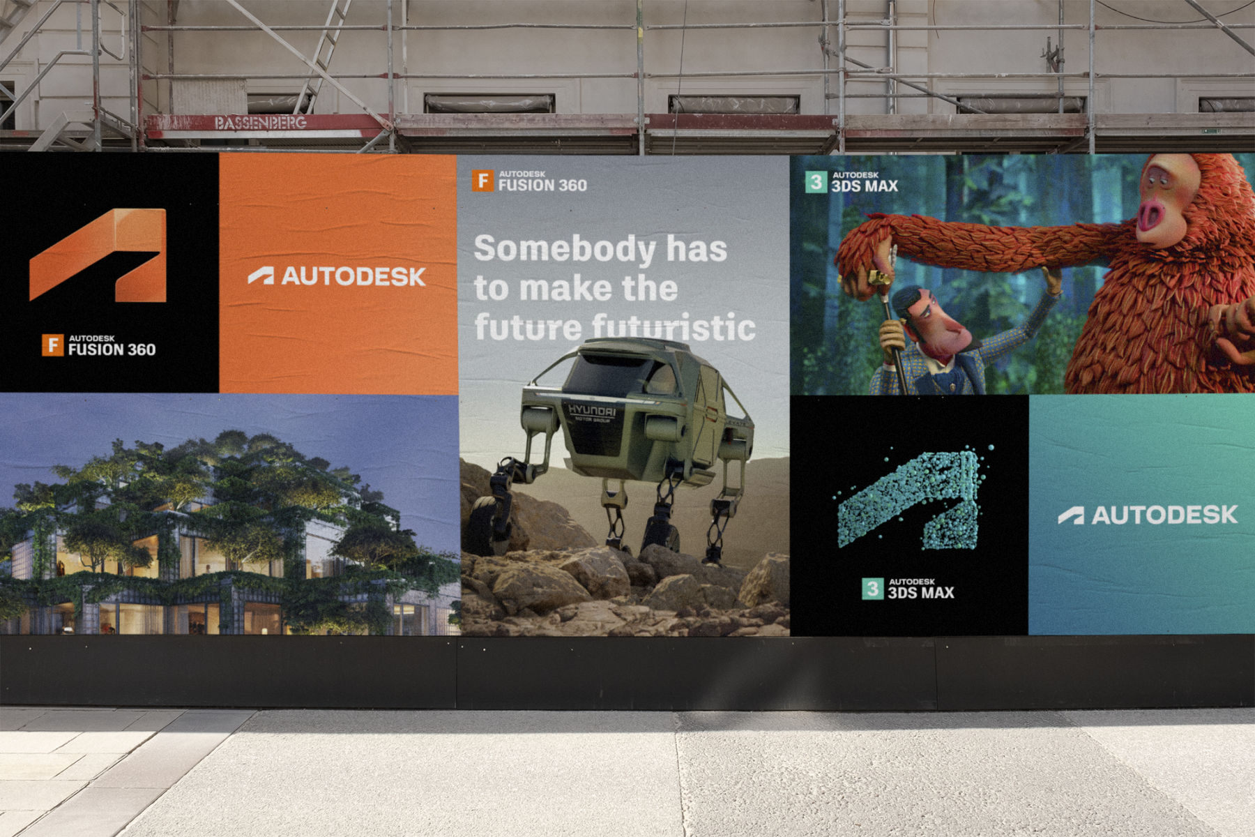
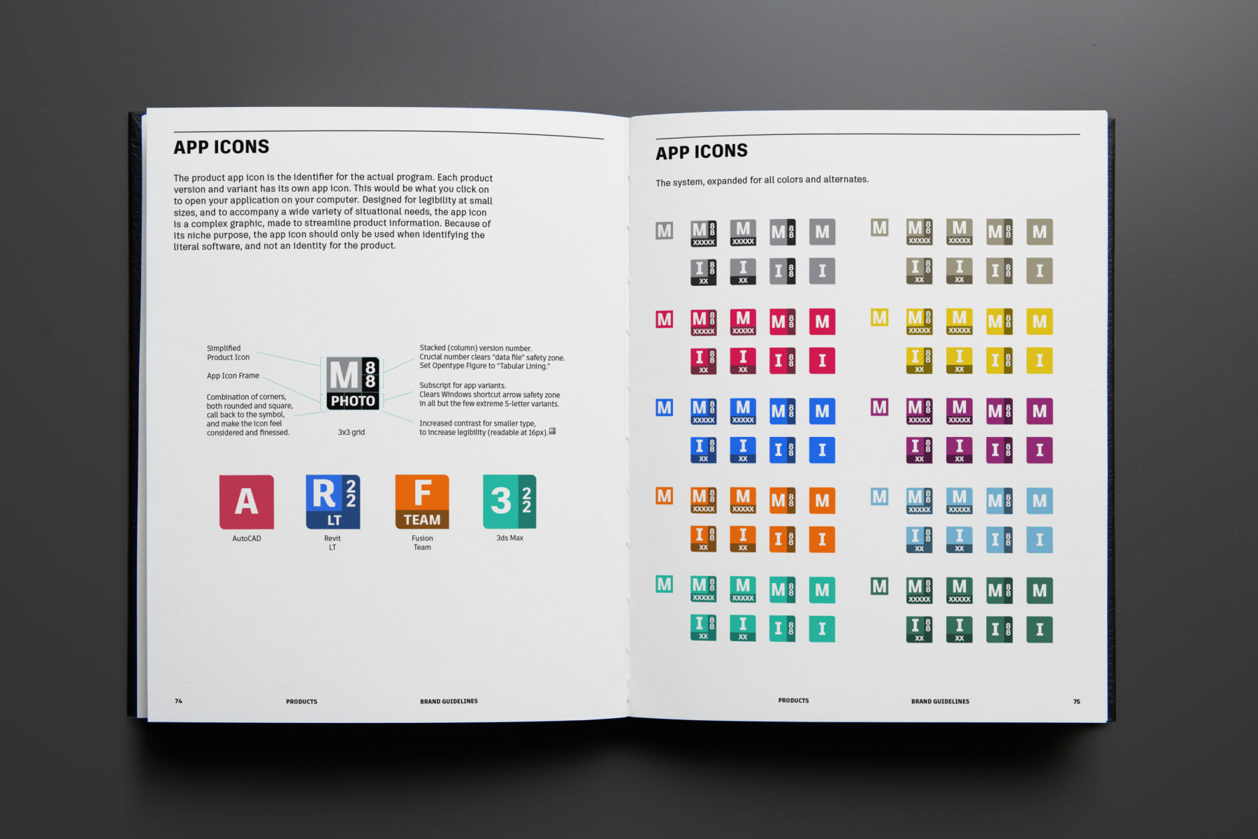
In addition to the rebrand, Autodesk needed a scalable, comprehensive product identity system that closely correlates with the parent brand, but with the flexibility to encompass a wide range of adapted naming conventions from its 100-plus-and-growing product lineup. With a focus on clear hierarchy, visual cues were reduced so that the product was identified by a range of colors but otherwise united in look and feel. The parent colors of black and white universally pair with each product color, while giving prominence to the ever-present Autodesk brand.

11 ADSK Product
12 Left ADSK Symbol+Type PDM
12 Middle ADSK Symbol+Type AEC
12 Right ADSK Symbol+Type ME
13 ADSK OOH-Wildposting
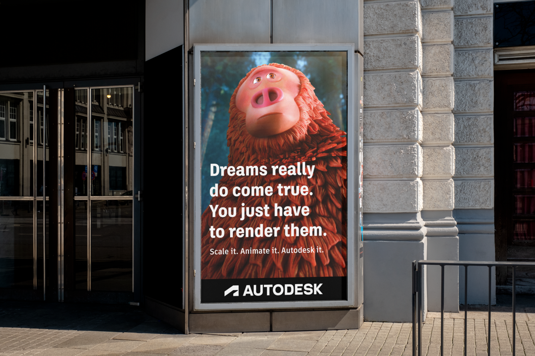
14 ADSK OOH-Poster

Brand Guidelines

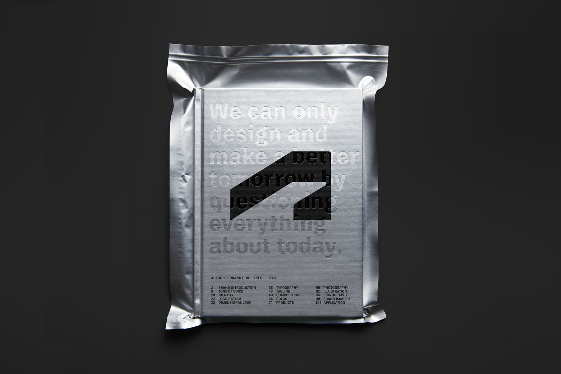
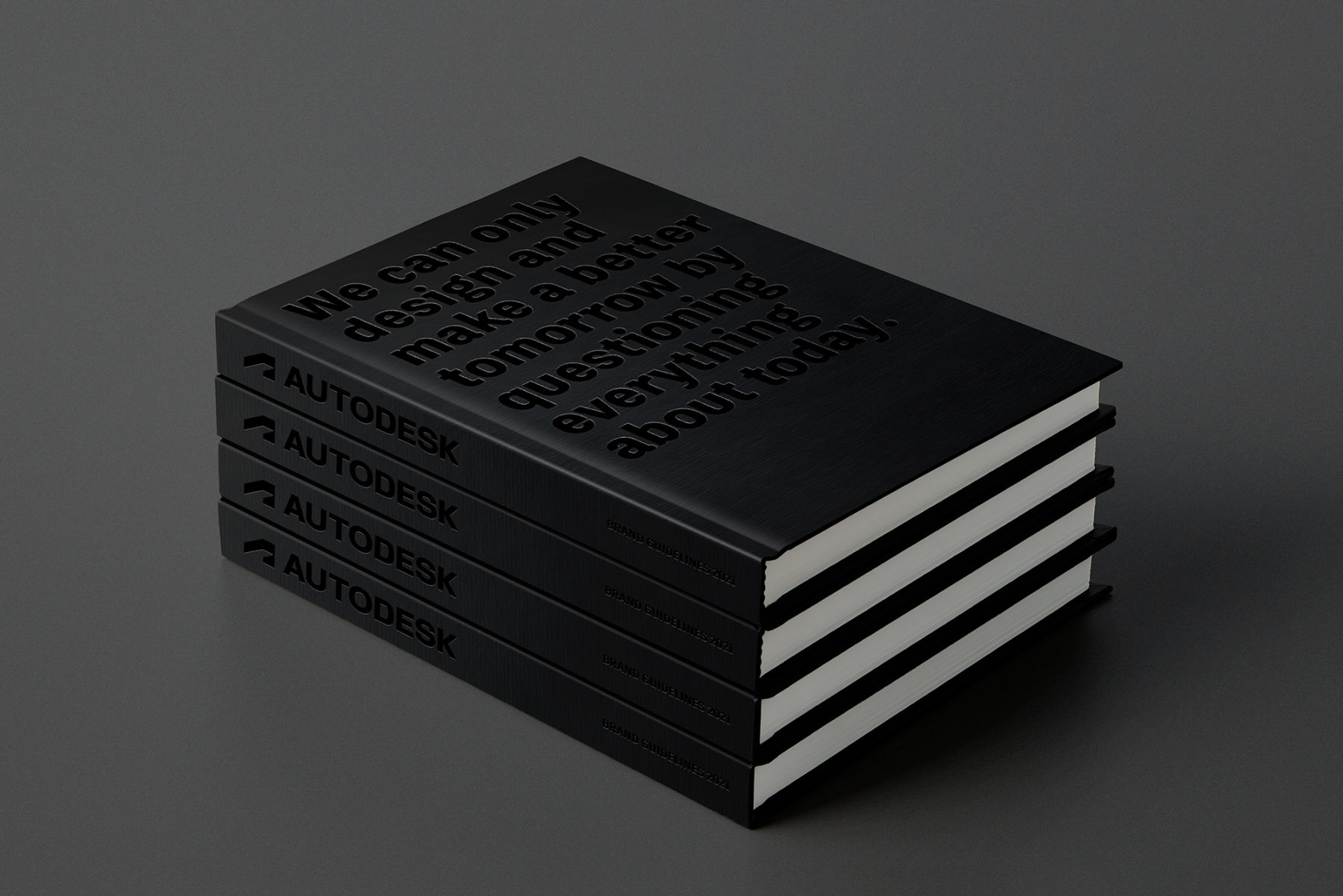
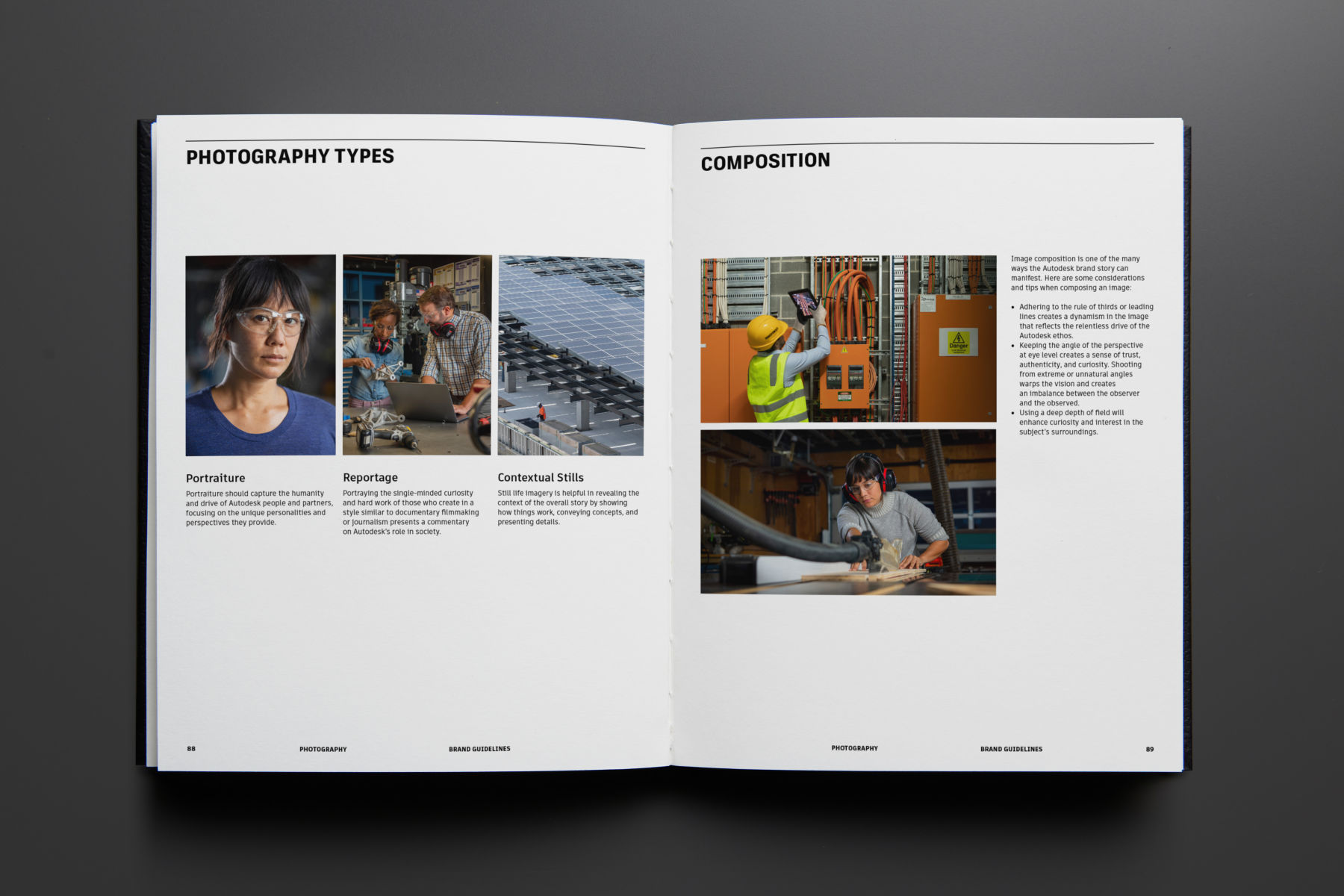
A new set of guidelines helped to lay out the usage rules for the new parent brand and product system, including our recommendations and strategies for layout, color, type, tone, and photography. All of which imbue the parent brand with authenticity and confidence moving forward.

15 ADSK BrandBook Foil
16 ADSK BrandBook Stacked
17 ADSK BrandBook Spread 01
18 Left ADSK BrandBook Spread 02
18 Right ADSK BrandBook Spread 03
Current Time 0:00
/
Duration Time 0:00
Progress: NaN%
20 ADSK Laydown

You can see our updated Privacy Policy here.