How did you factor in the latest fashion trends into your design?
We did an audit of all the latest fashion trends in Crocs. This included not only the ideas, but also materials and how Crocs were being worn. Something we considered is how we wanted KFC to speak about itself in regards to fashion now and in the future. Making something extravagant and being self-aware of its ridiculousness and even “lack of fashion” was on purpose. Anti-fashion fashion. Delicious!
How did the clog version come about? Is that something Crocs already had in their lineup, or did you see platform Crocs as the next hot thing?
The classic clog was part of Crocs’ product lineup, so we started design-concepting with that one. We designed so many versions, including some head-scratchers. It got weird quickly.
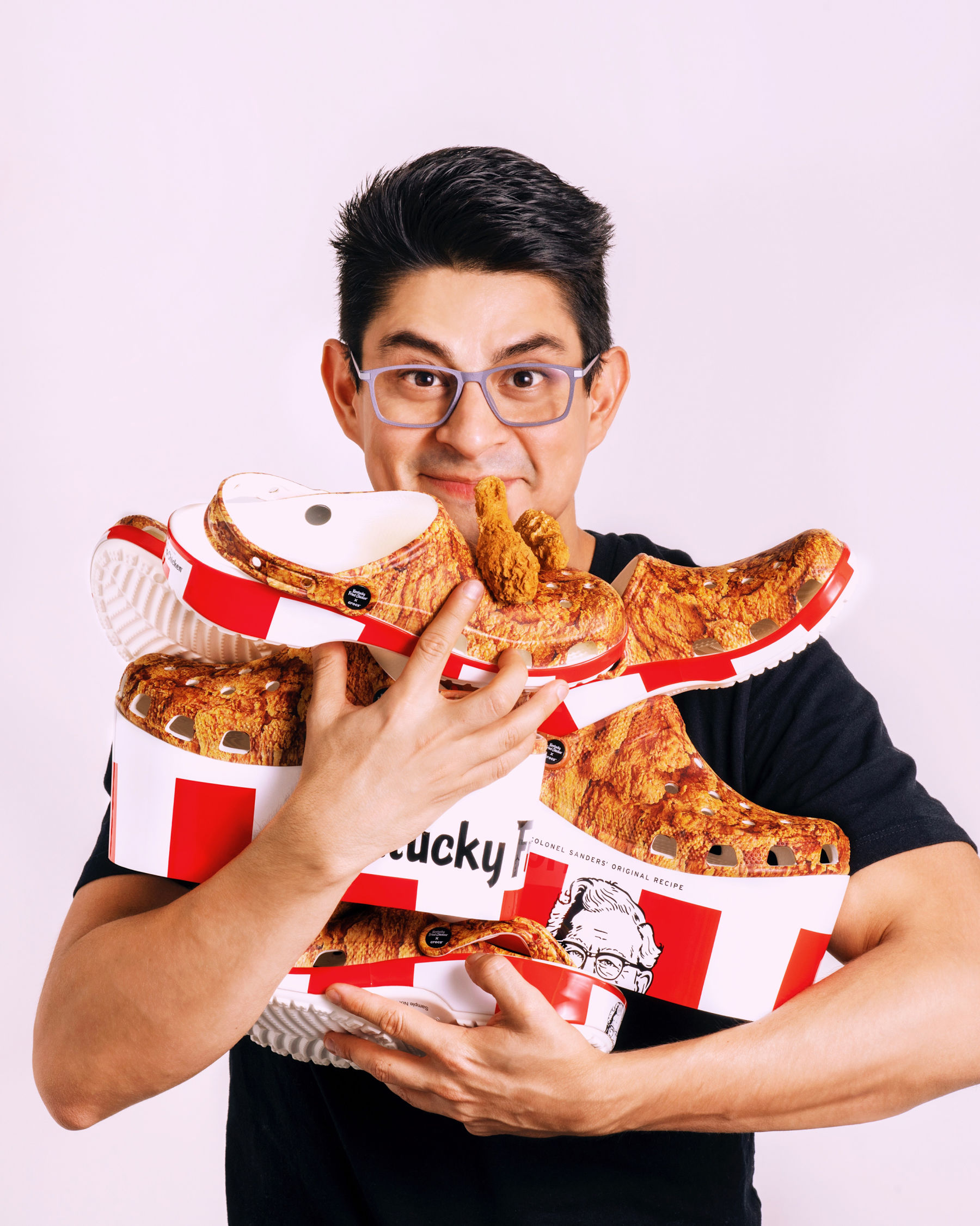
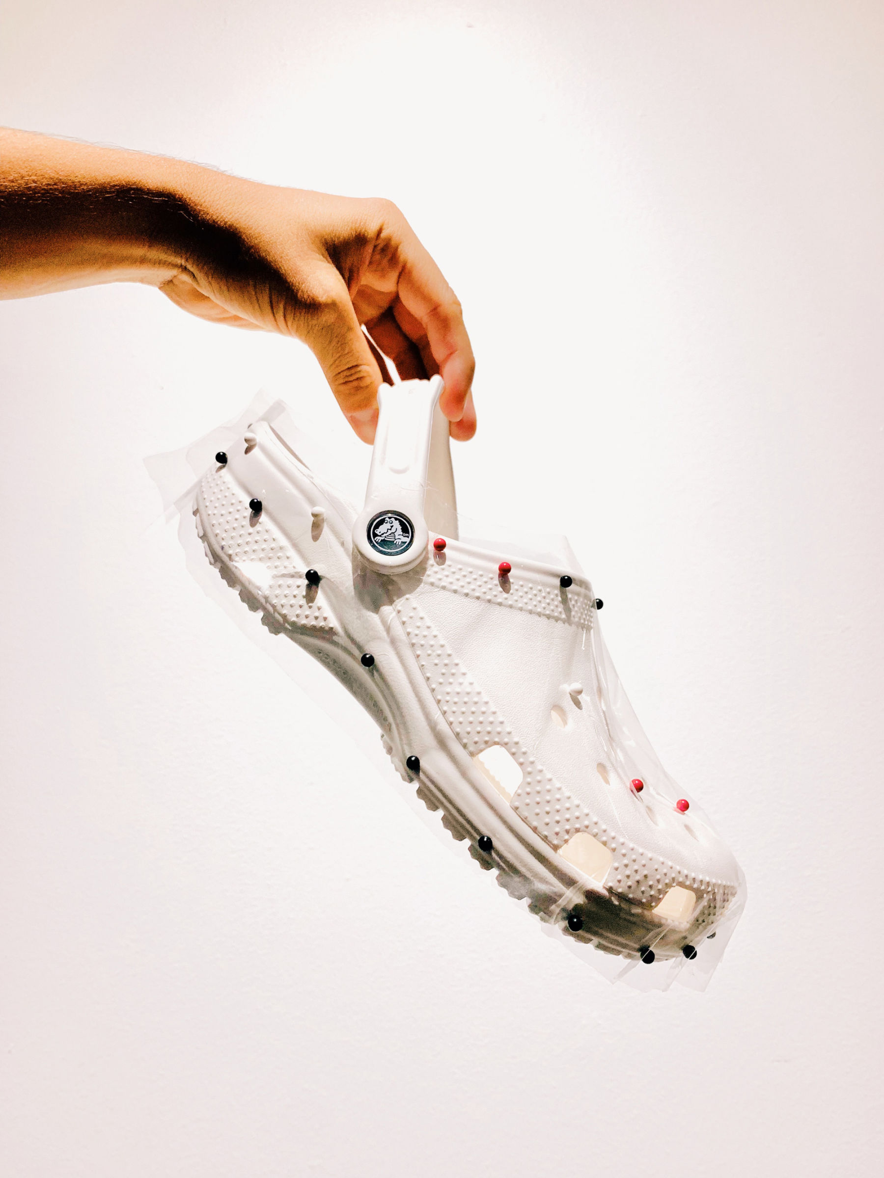
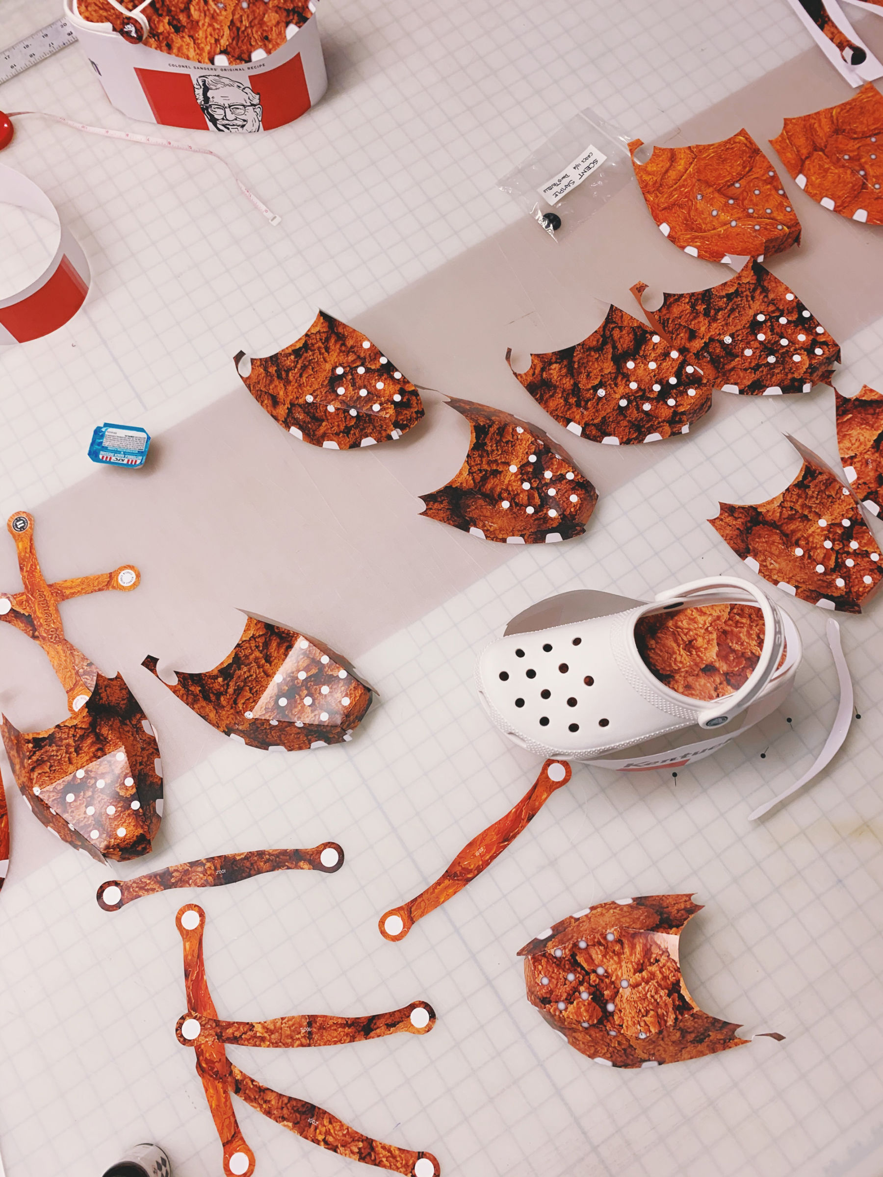
The platform was a happy accident. I purchased my very own Crocs. They were white, blank with no graphics. I kept them on my desk so I could stare at them daily and familiarize myself with their form. The 1:1 scale model I got wasn’t my shoe size, but I wore them anyway (with the strap flipped over the front). One evening, after comping up a few ideas, I stood up and placed the sample Crocs over an empty KFC bucket I have at my desk and walked away. As I was moving away from my desk, I noticed from a distance that the bucket sort of looked like ridiculously oversized platforms of the shoe that was sitting on top. I quickly went back to comping up a new model that accounted for a pair of Crocs that, when put together, would resemble KFC’s iconic heritage bucket. I presented the oversized platform to the rest of the creative team, and everything unfolded from there.
The platform Crocs aren’t anything new, really. Balenciaga did their own back in 2018. The difference with ours was the dramatic height that, though not new to the fashion world, was new to Crocs.
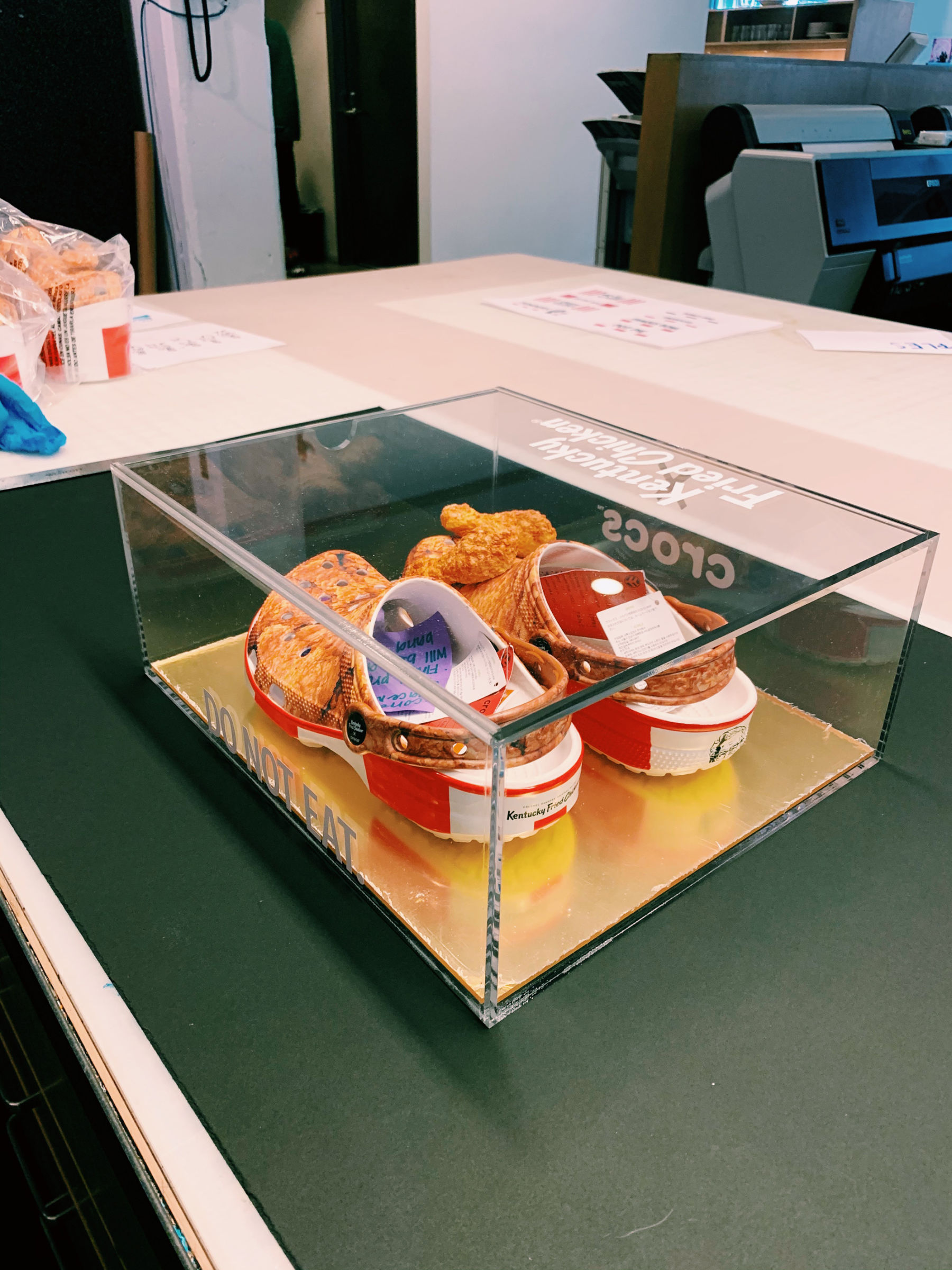
The dramatic height presented a few challenges. We worked with Crocs for months on a prototype that could still get people talking but also meet their criteria for production. We ended up with a much shorter platform, but that allowed for the heritage KFC bucket design to be reinterpreted in a contemporary way designed specifically for Crocs of that height.
KFC is iconic in its colors, did that make the process easier for you?
The process was pretty straightforward, but it also included a lot of details to consider. The process was long; and the product design team at Crocs helped us get there with their expertise.
I’m about to get full-on geek here. Bear with me... :)
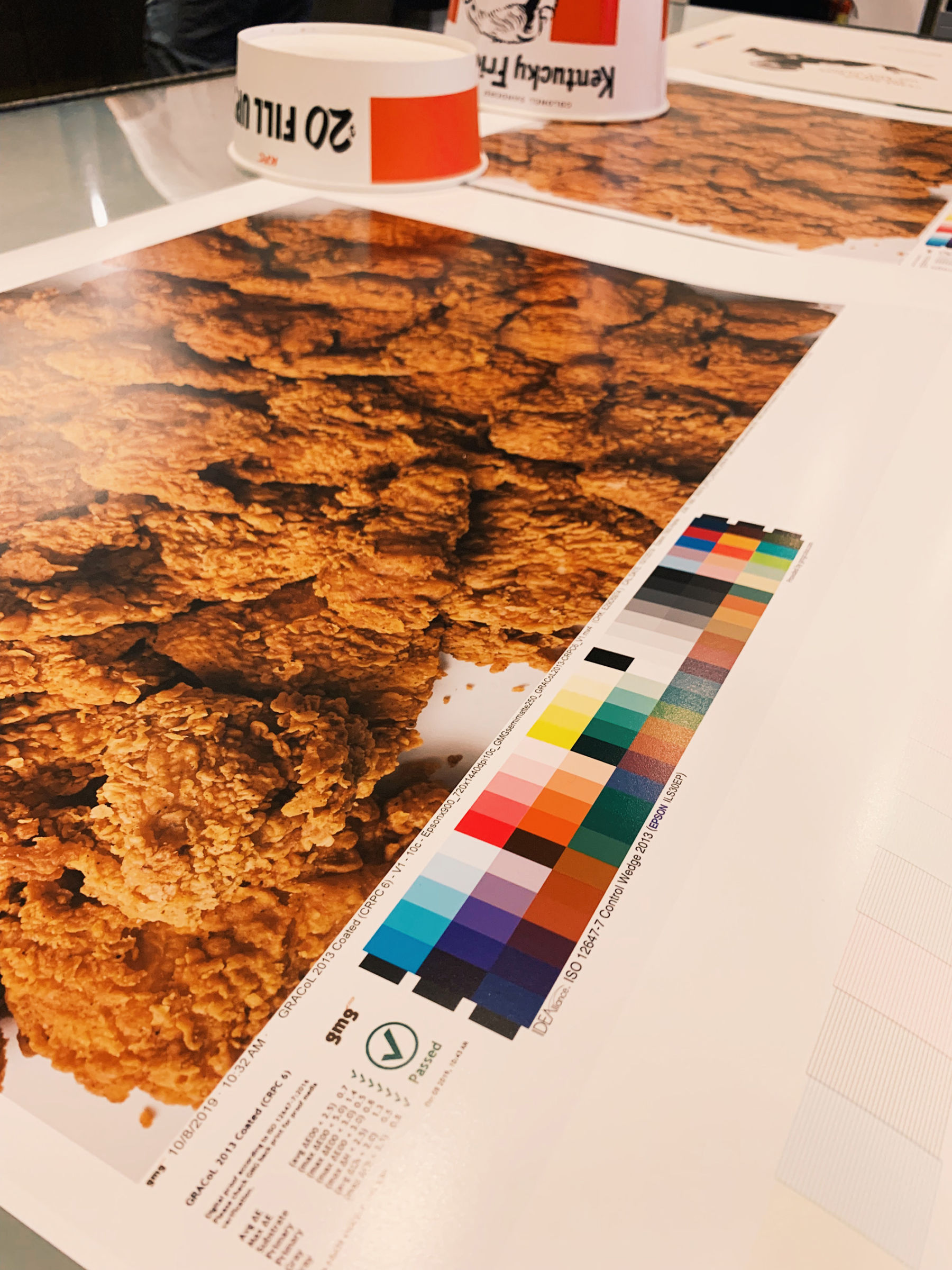
First, KFC uses a very particular shade of red. To achieve that brightness on a foam material we had never used before was a challenge. The material absorbs ink in a way that can make the darker values look muted. Or, like we found out on some tests, colors got very dark in areas with less foam thickness, so the contrast on the chicken texture would change drastically.
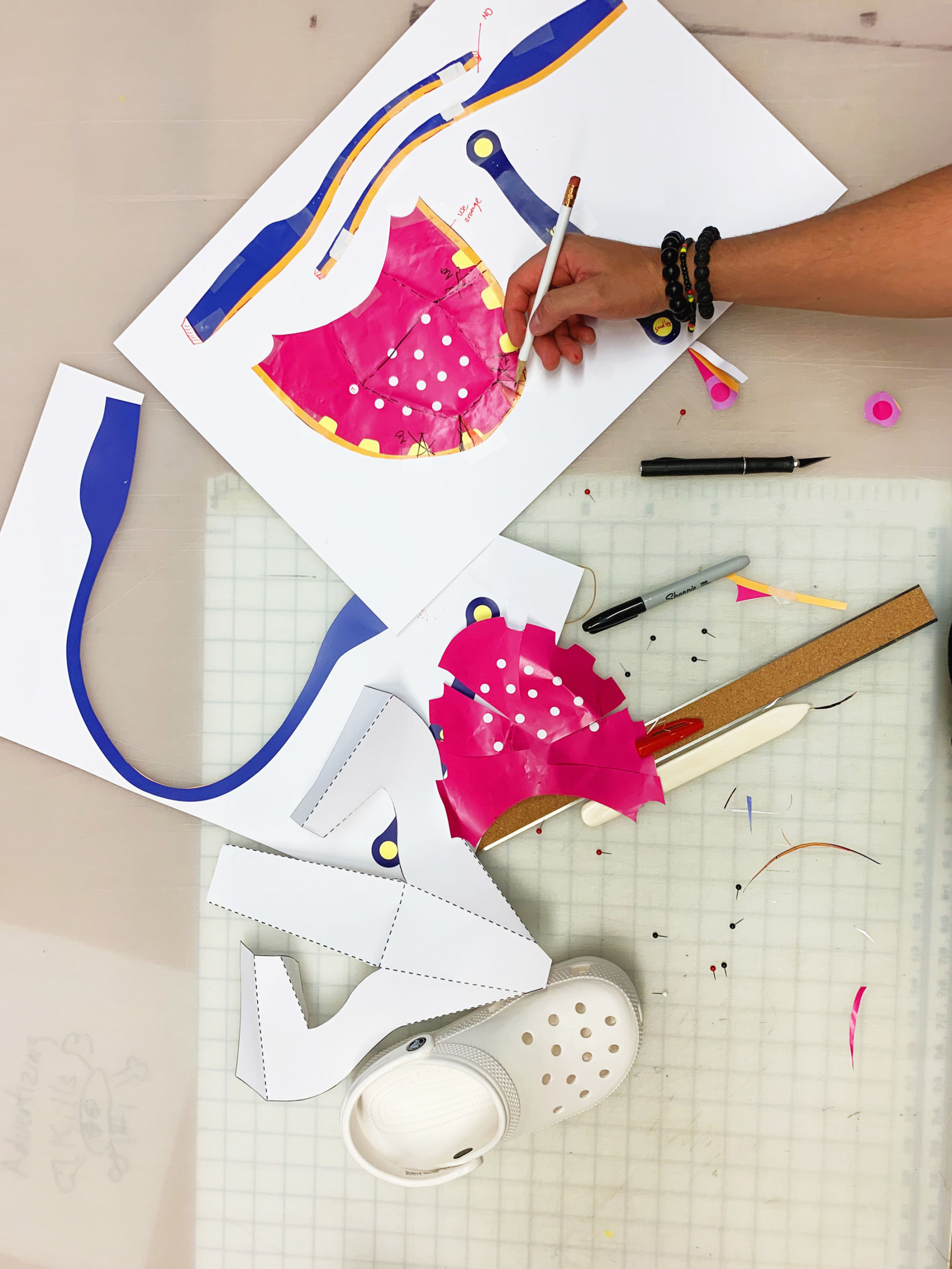
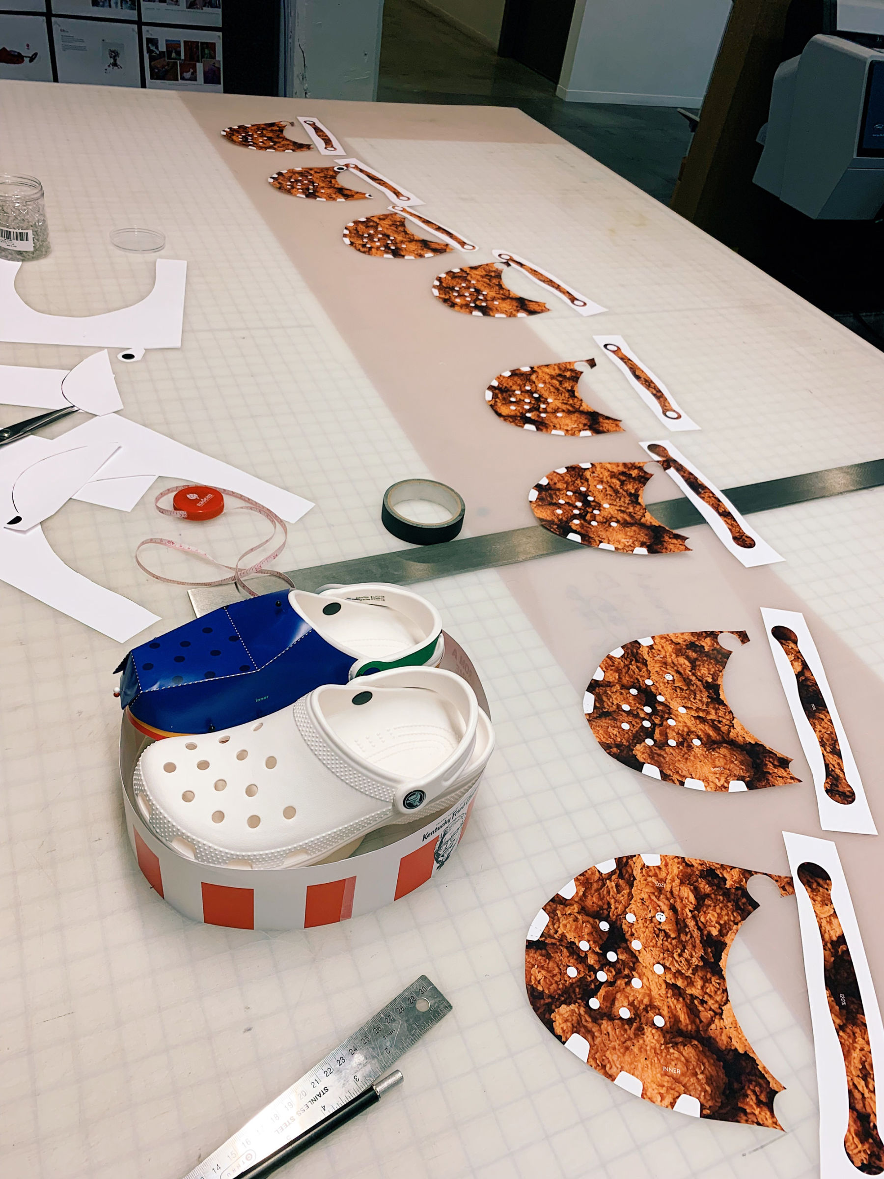
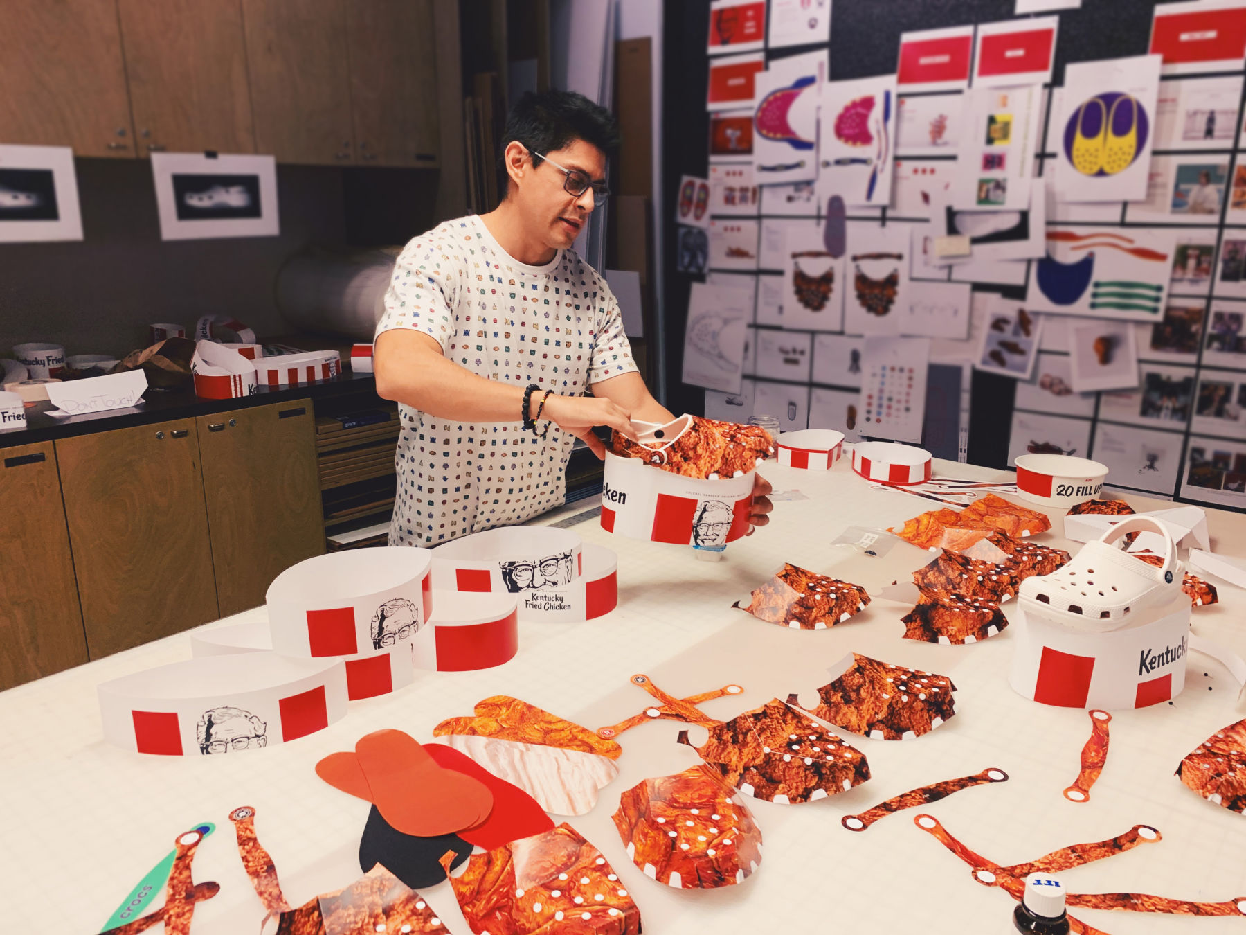
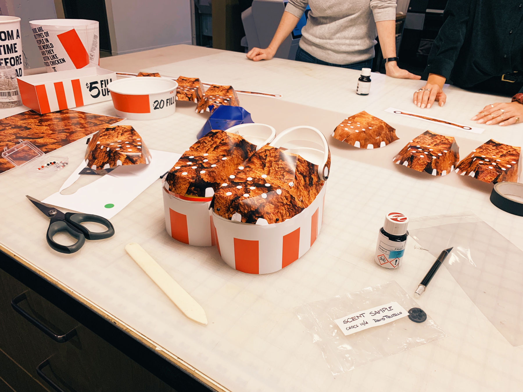
Also, KFC’s design aesthetics use thick red and white stripes in sets of uneven numbers and spaced out evenly. When you add the Colonel’s head or other graphics on the bucket, then one needs to account for the extra spacing to avoid odd trappings around these objects and the stripes. On a bucket, it’s easier to account for one cylindrical shape to meet this criteria of graphics. Now, if you think of the platform Crocs as two different cylinders, but each has stripes and each shoe has different graphics, then the stripes will move around the shoe differently. To create the effect of a person wearing the Crocs with their feet together, and for the stripes to mirror each other, and therefore, the illusion of one continuous bucket was a math problem of its own. Quick paper prototyping of these “cylinders” and then moving them around in a 3D model was very helpful.
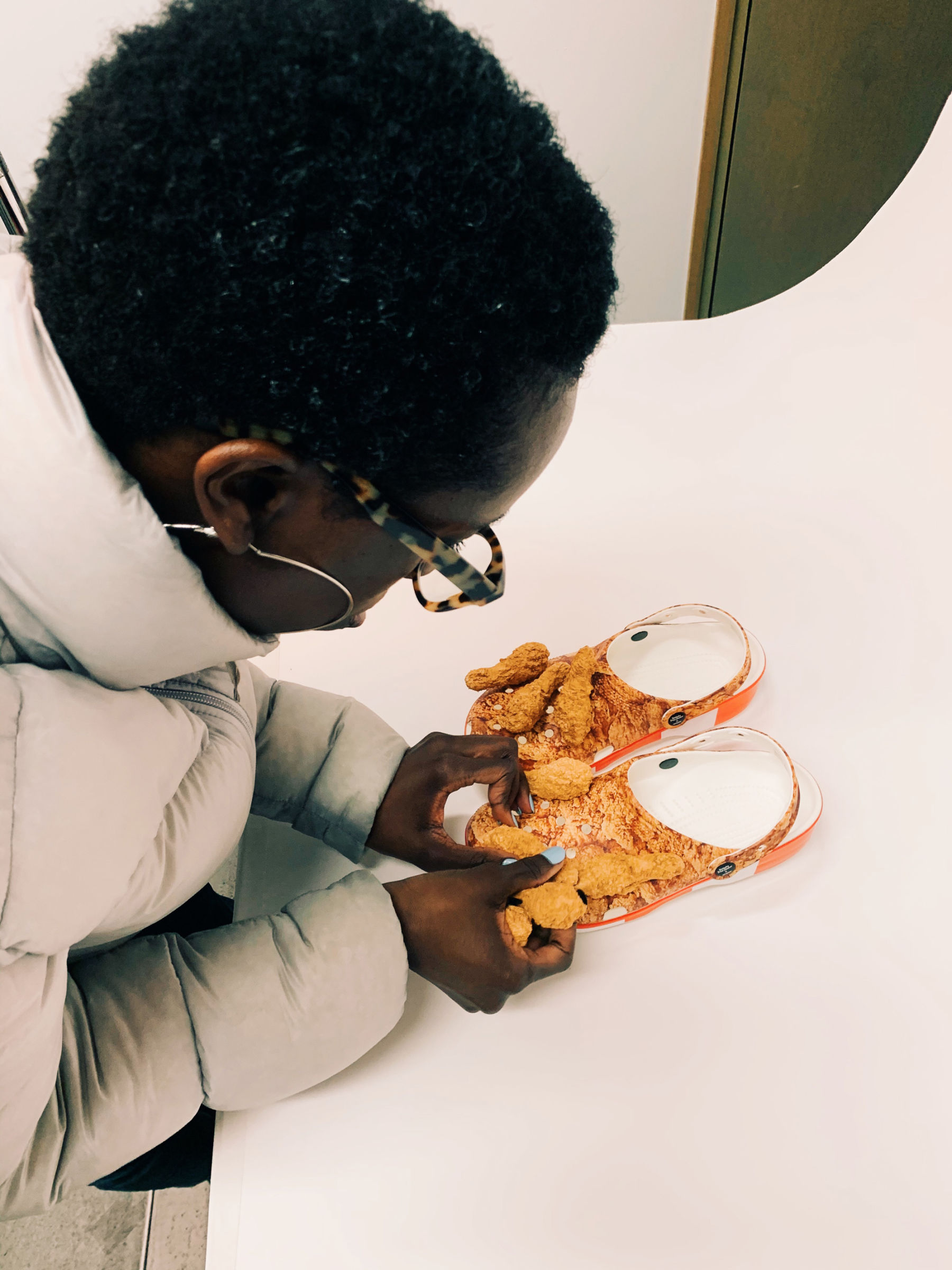
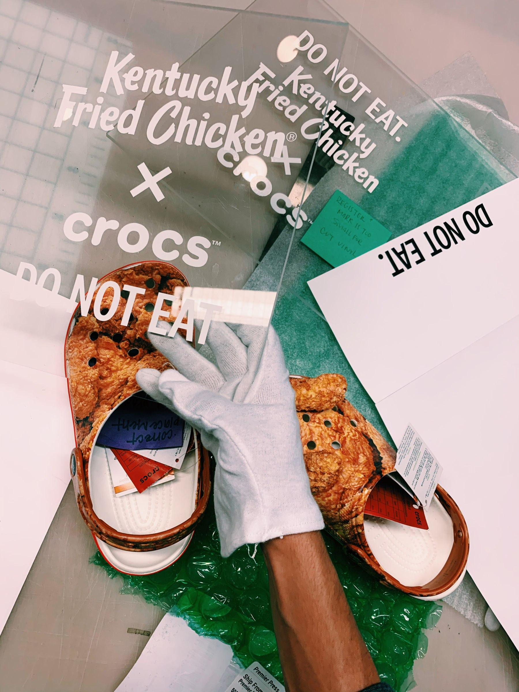
Another big part of KFC’s color palette is the fried chicken itself. To ensure we’d get the exact golden color of the chicken, we ordered KFC and worked with the franchise to ensure each piece was carefully wrapped and protected. This allows for the fried breading to remain as intact as possible during transit and for color to remain on the chicken pieces. We then shot a big texture of chicken and single plates of chicken drumsticks. We worked with our photo and retouching team to match what you see on-screen to what we had on set. We also printed color proofs, which we mailed to Crocs to help us match color across the clogs and the Jibbitz.
One last piece of the puzzle was the size of each graphic element. More red stripes and black and white graphics meant there was less white space. Those alterations change the “face” of the clog. Smaller pieces of chicken also meant there were more shadows making the clog look darker. I think I looked over 40 different clog and texture size combinations to arrive at our well-balanced hero that could work across different shoe sizes.
What was the most difficult part of this project for you?
I’ve led design projects in various mediums and each presents its own unique set of challenges. For Crocs, I think this was the first one where I had to figure things out at every step of the way. It was like building the plane while flying it.
Another aspect, perhaps not the most difficult but certainly another layer to consider, was units. Everything that had to do with the Crocs design I had to build in the metric system, as we were dealing with manufacturers outside the U.S. and while everything else, campaign included, was in pixels and inches. Now, I grew up outside the U.S., but trained here, so switching back and forth comes natural to me. However, if one considers the multiple number of moving pieces that stem from a shoe design: concepting, paper engineering, 3D prototyping, brand design guidelines, production design in different unit systems, scent design, fashion trends, food, production feasibility, photography, film, social strategy, overall expectations, and more… shoe design becomes one carefully orchestrated movement made possible by an amazing team of designers and problem solvers that I’m extremely proud to be a part of.
