To reintroduce the OG dating platform OkCupid to a young audience, we redefined a dirty digital-dating acronym and turned it into an empowering rallying cry for modern romance.
OkCupid: DTF
MediaNew YorkWe reinvigorated a dating leader by reclaiming a digital dating acronym.
AgencyNew York
January 2018
While once the go-to for young daters, OkCupid was losing ground with the rise of apps like Tinder, and in danger of being relegated to “the dating app I used to use.” Our challenge was to reconnect the powerful platform to a young audience, specifically young women. To do so we took one for the team and immersed ourselves in the world of modern dating, and we found that while our audience made use of digital/mobile dating apps when looking for love (or whatever), the overall experience of using those apps left a lot to be desired.
Built around a more single-minded mechanic, other apps offered up dating that was big on physical payoff but short on substance. In contrast, the OkCupid experience was designed to allow potential daters the chance to find out as much as possible about their match, revealing the person behind the profile.
“Striking ads that are like little works of art.” - Adweek
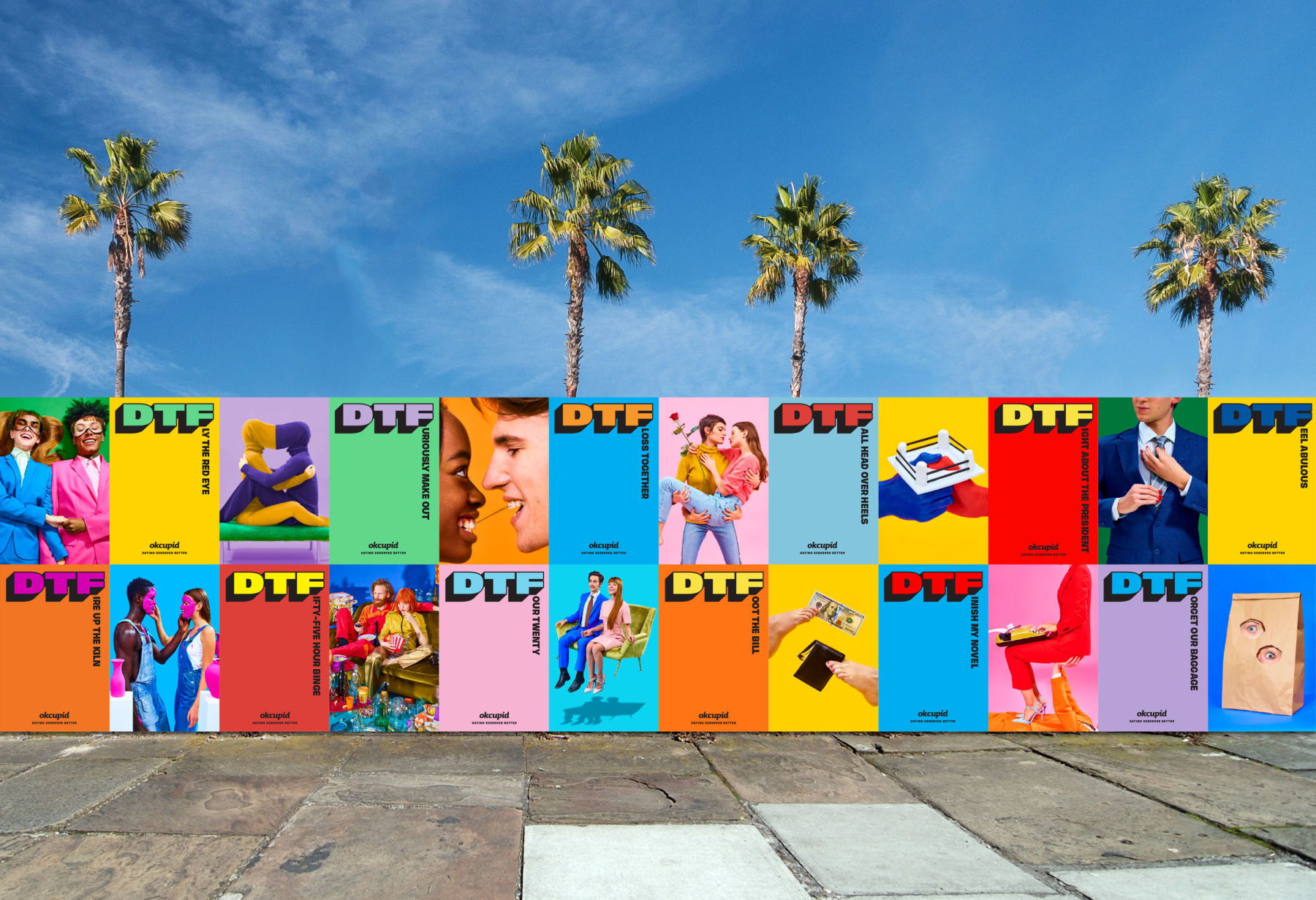
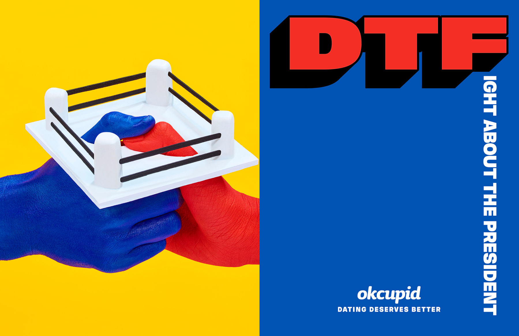
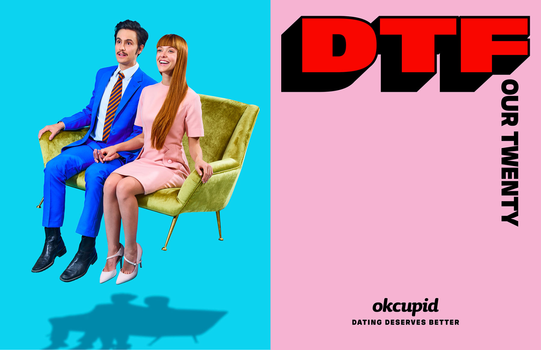
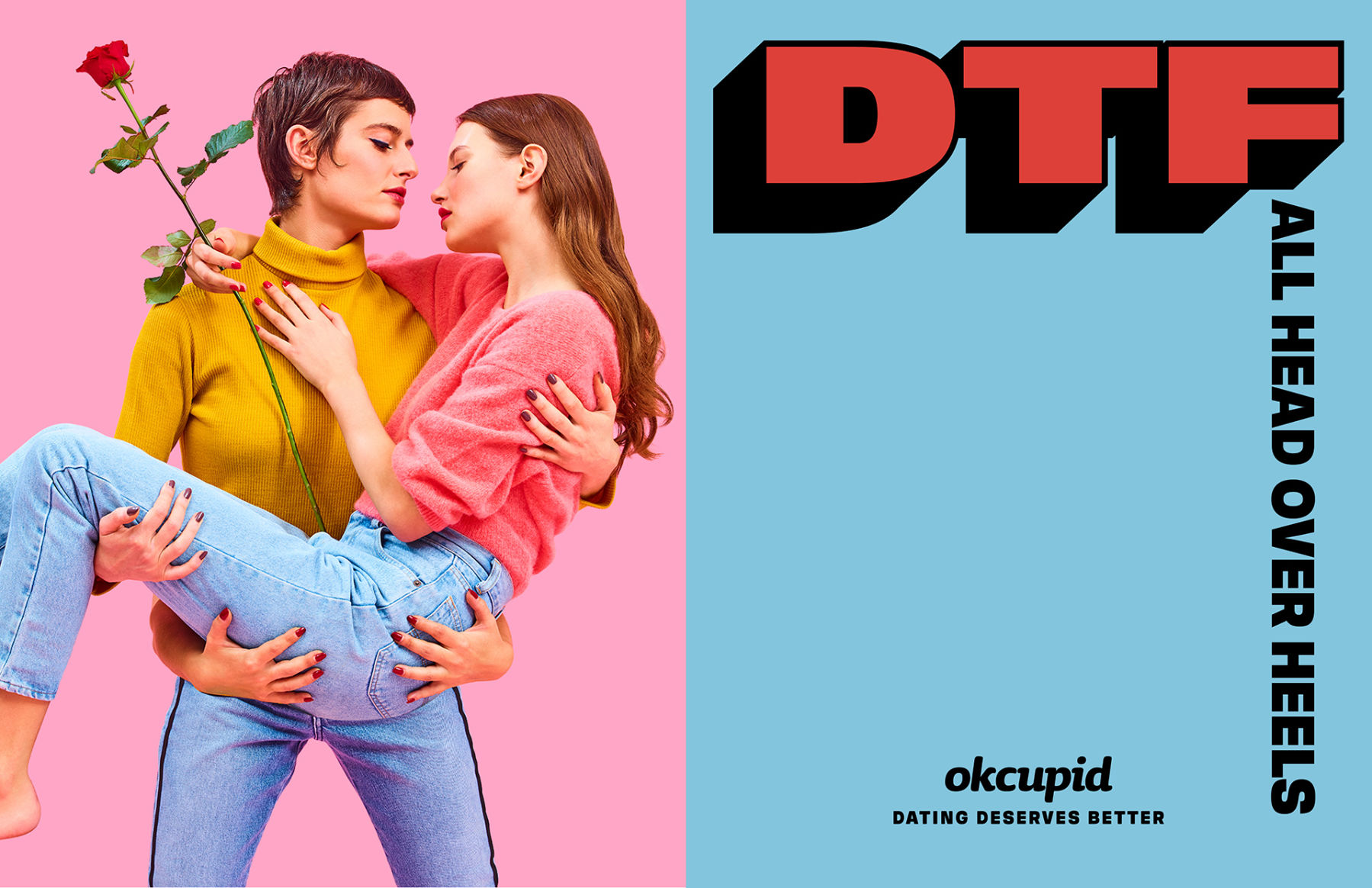
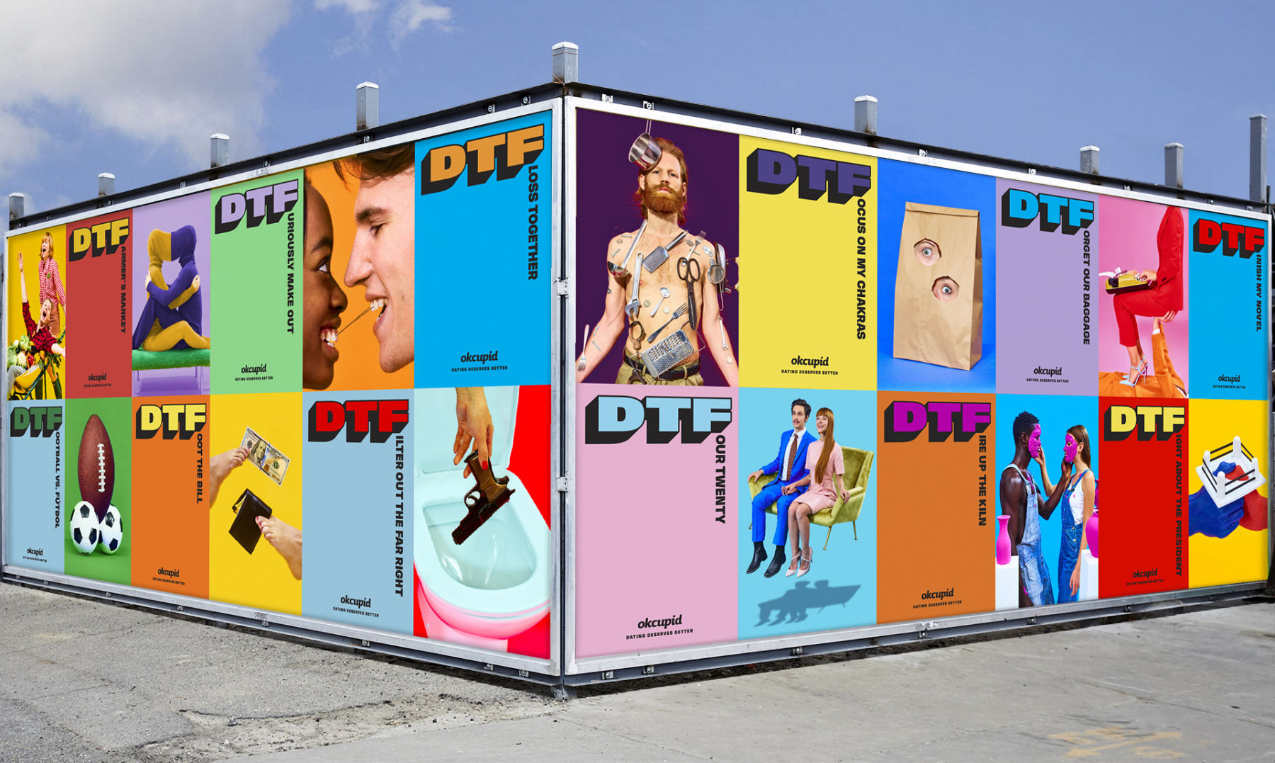
We made OkCupid the champion of dating with depth, while also reflecting the issues and passions that our audience cares about, by creating a campaign that subverted a popular modern dating acronym “DTF.” While in popular parlance that "F" cuts to one very specific chase, we used the F and the phrase to showcase the personality of dating profiles, while not-so-subtly confronting the other “hook-up first, questions later,” apps.
We turned the substance behind OkCupid user profiles—like an interest in pottery or and opinion about politics–into something desirable, fun and sexy. The painfully obvious “Down To Fuck” became the joyfully surprising "Down To Fire Up The Kiln," "Down to Farmers Market," or "Down to Four Twenty." The campaign changed the conversation about dating culture and empowered each individual to interpret DTF in a way that reflects what they want from dating.
We designed the ads to command attention: we worked with Maurizio Cattelan and Pierpaolo Ferrari (creators of Tolietpaper Magazine) who brought a playfully provocative, vibrant, graphic aesthetic to the imagery. Bold typography emphasized the eye-grabbing acronym which was subverted with unexpected interpretations of the “F.”
Results
In 10 weeks, we saw increases across all key brand health metrics, including a whopping 30% growth in the brand’s social audience as well as a 25% increase in revenue due to new users. The campaign also made a real impact in cultural conversation, receiving extensive coverage from major news outlets and organizations like the ACLU and Planned Parenthood, which has resulted in one billion earned media impressions.
Share on